

The work.
Overview.
Media.Monks, a leading digital-first, data-driven advertising, marketing, and technology services company, faced a challenge. Since 2018, S4 Capital, its operating brand, acquired Media.Monks through strategic agency and team acquisitions. However, the rapid expansion under the leadership of Sir Martin Sorell led to a lack of specialization, as evidenced by market research. Customers couldn’t discern Media.Monks’ primary specialty.
To address this, Brady Brim-DeForest, the former CEO of TheoremOne and current CEO of Formula.Monks, was tasked with developing a new Media.Monks brand vision and value proposition. After I successfully rebranded Formula.Monks, Brady approached me to collaborate on the upcoming vision for Media.Monks.
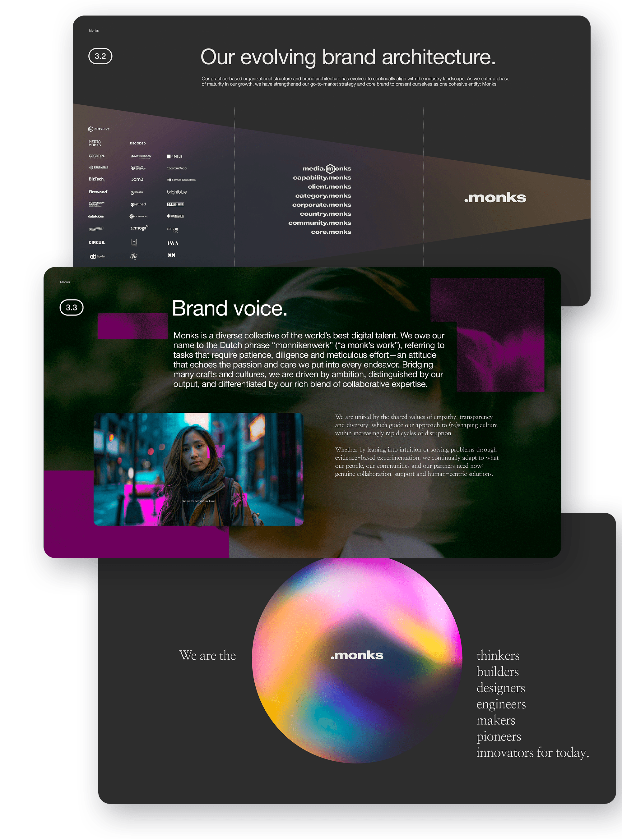
Our initial objective was to understand the organizational structure. With over 40 properties operating independently and collaborating, unification of properties, leadership, and branding was necessary. We restructured the organization into Marketing and Technology groups.
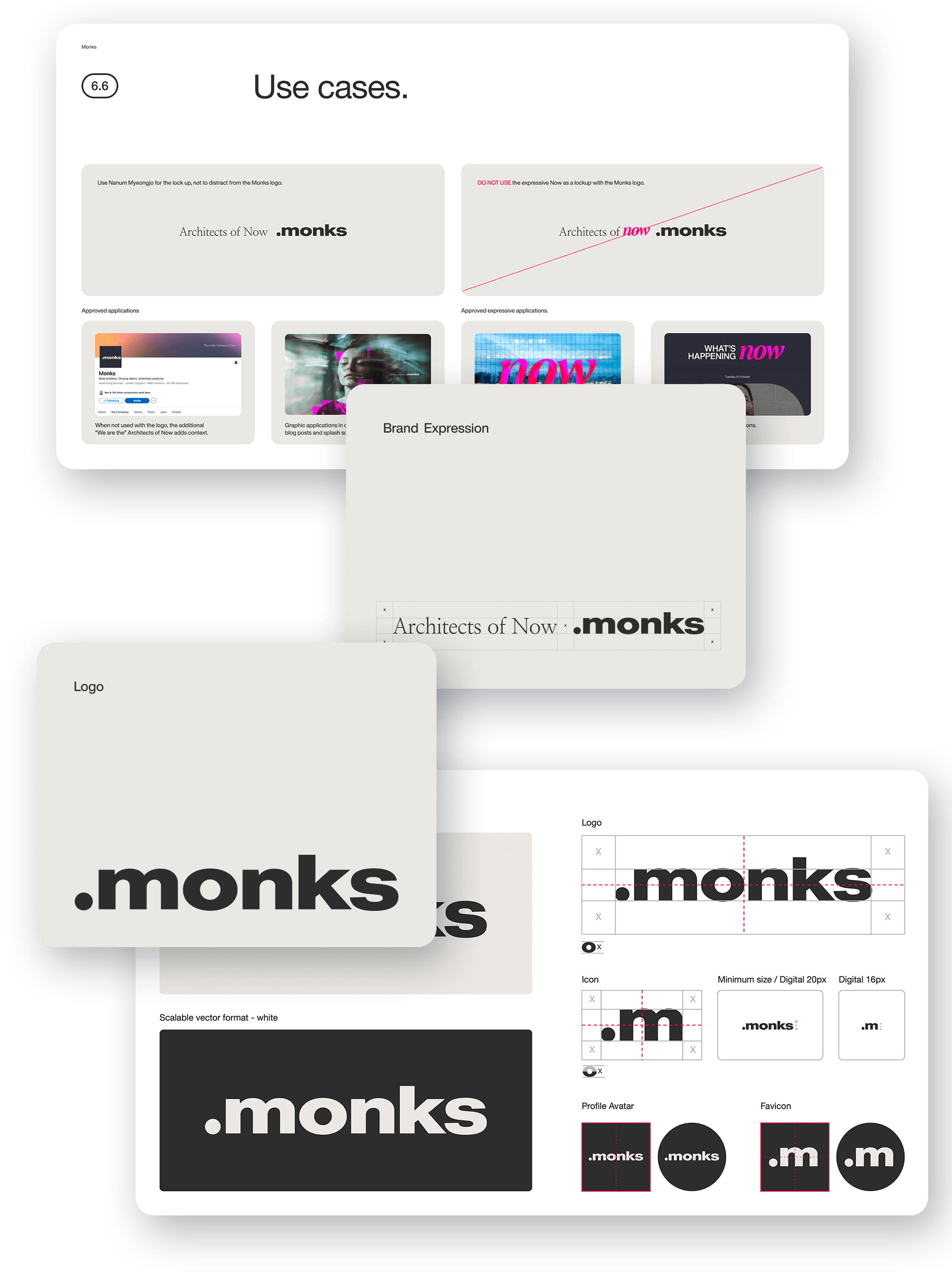
However, the existing company name, “Media.Monks,” didn’t align with the new structure. We discontinued the “Media” component, resulting in Media.Monks becoming Monks.


The dot.
When I first approached the redesign, I knew it needed to be anchored in The Dot. Born out of the S4 acquisition, when Mediamonks became Media.Monks, The Dot had evolved into more than a graphic element; it was the connective tissue of the brand. After a few late-night conversations with Brady and a stack of design explorations, I kept circling back to that Steve Jobs moment in 2007: “An iPod, a phone, and an Internet communicator … are you getting it? These are not three separate devices, this is one device, and we are calling it iPhone.”
At Media.Monks, we were consolidating over 40 properties into just two core offerings. The solution? We pulled everything into The Dot, literally. What came out of that was a motion language that captured the spirit of integration and ultimately set the tone for the visual identity that became Monks.
All the things.
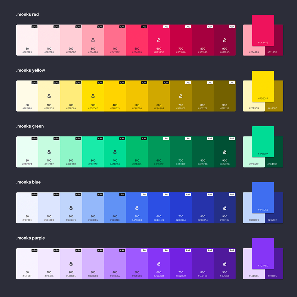
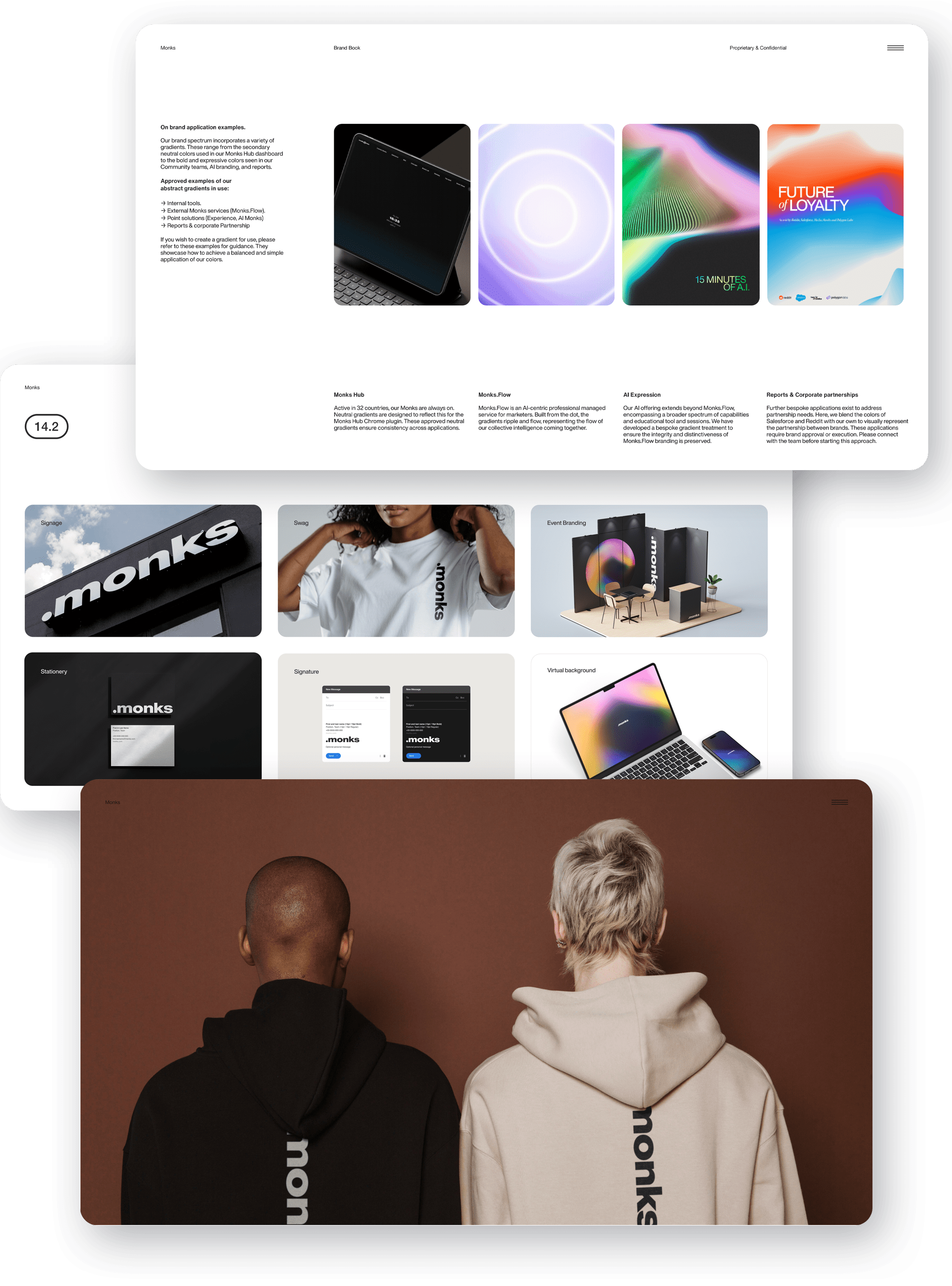
Designing a brand is one thing. Redesigning a global one, including the style guide, identity, tone of voice, slide templates, and full rollout across a multi-billion dollar agency network, is something else entirely. From the start, we knew the only way this would scale was through structure. I leaned on Romina Kavcic and her excellent Design System Guide as the foundation. It gave us a framework to stay organized, document decisions, and build something that felt both intuitive and future-proof.
That meant defining a tokenized system in Figma to manage component variables, something the original guidelines never addressed. Along the way, I also uncovered gaps in accessibility and WCAG compliance. These were not small oversights, so I introduced a set of documented standards to bring consistency across the board.
To keep it all clean, we implemented a clear file and folder hierarchy for easy navigation and version control. Long term, I would like to transition the team away from Google Drive and into a proper digital asset management system. That one is still on the wishlist, but it is coming.


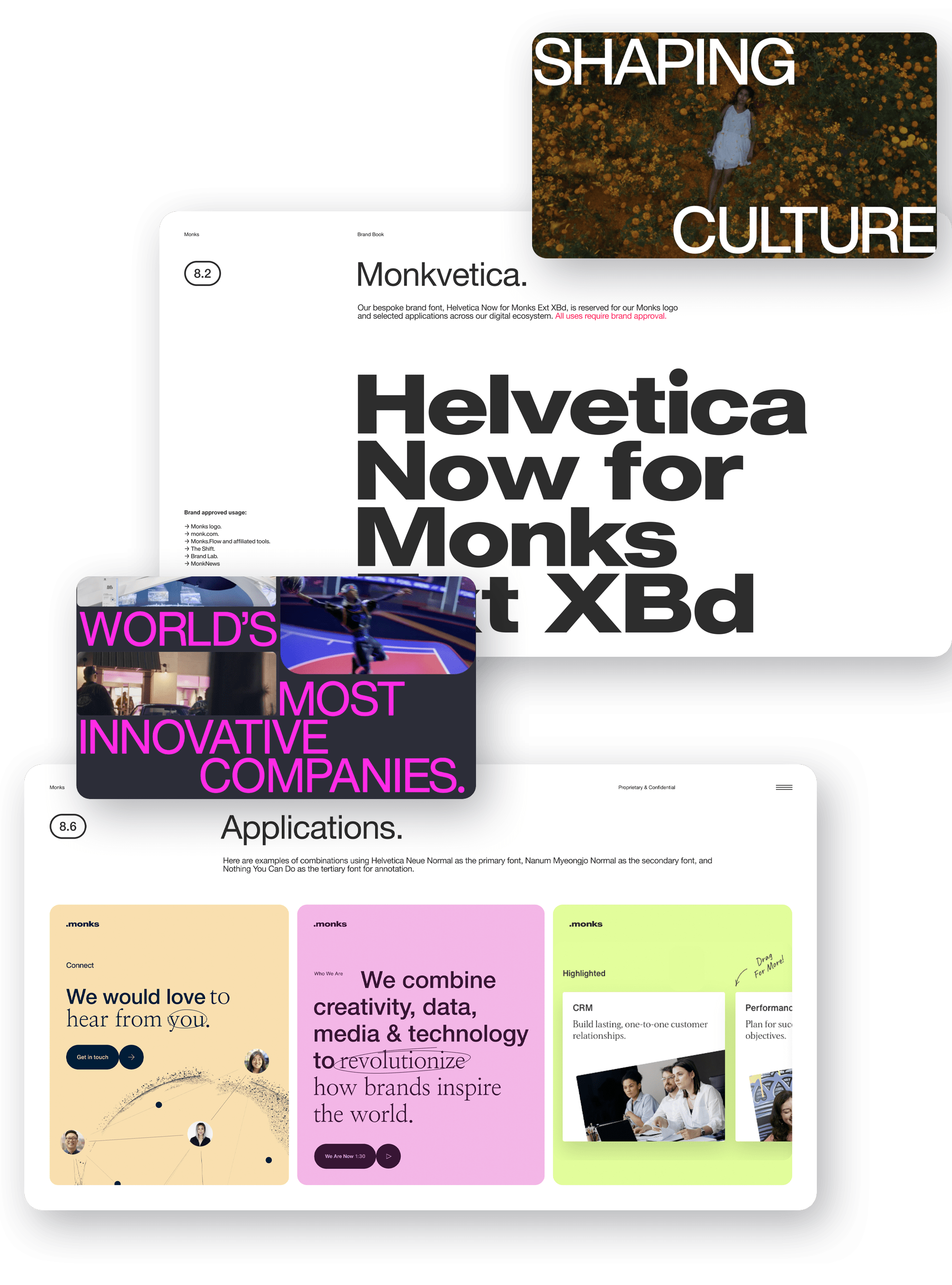
Upleveling digital maturity.
Monks has been shaping digital culture since 2001. What started as a creative powerhouse grew into a globally recognized force across content, data, media, and tech. Today, it is one of the few agencies that truly blends consulting, enterprise software, gaming, film, social, advertising, and measurement into one cohesive ecosystem.
I am grateful to Brady Brim-Deforest and Sir Martin Sorrell for trusting my vision to help bring clarity and cohesion to a brand with so many moving parts. Together, we rolled out a polished and unified refresh that not only aligned the brand across all touchpoints but also gave teams the tools they needed from day one. That included hundreds of pre-designed decks, templates, and training resources to support the launch. Even with multiple business units pursuing different goals, we put systems in place to explain the reasons behind the changes and to ensure every piece landed exactly where it needed to.


Press.
"Having witnessed his work first-hand, I know how much dedication and care he puts into every project. He should feel immensely proud to see this world-class brand come to life. I always get to witness his talents every day, but I'm so proud the rest of the world gets to see it too!"
More with
Monks
More client partnerships
Please note that this portfolio is undergoing active updates and contains an extensive back catalog.
(Last updated: Feb. 28, 2025)