
Website · Mobile app · Brand identity · Design system · Strategy
Prospect Sports
Overview.
Enter Decentralized Sports Gaming
I joined Prospect Sports in 2021 as Lead Brand & Design Strategist, working with the founding team through the following year to build the brand identity, the website, and their first mobile product together.
Prospect believed a fan's belief in an athlete should carry real value beyond the volatile, disconnected value of a trading card or an NFT. Their Decentralized Fantasy Sports (DeFS) product ties rewards directly to real athlete performance through a system they built called Proof-of-Performance, giving fans a stake that moves with the game instead of the market.
My job was to give that idea a brand and a product people would trust, in a space, crypto and Web3, where trust is hard to earn and design maturity is rare.
The work.
Sports
Web3 / Cryptocurrency
Industry
Lead Brand & Design Strategist
Role
2021-2022
Timeline
Brand Identity
Design System
Mobile App
Strategy
Website
Services
Tools
What was delivered.
I came to Prospect through mutual friends, who didn't know my full background in design or in crypto. The initial ask was a cleaned-up brand identity, including the logo system and guidelines.
The engagement went well and expanded into building the pitch decks Prospect used to court VCs for their first funding round, which they secured. Once funding was in place, we moved into planning and strategy for the mobile app, and over the following year shipped a fully functional product on the App Store and Google Play. I was also responsible for the design, development, and execution of the promotional website and its hooks into the Web3 platform connecting to the app.
I took their initial brand notes and rebuilt the identity from the ground up. The only real direction I had was a reference to "TRON: Legacy," so I built a futuristic, neon palette around that feeling. The result was the brand Prospect was after.
Everything not all at once.
One of the most useful things about Prospect's backend was how easily it could scale to any sport. Getting there took real strategic planning to figure out how one brand could speak to a wide range of sports and their fan bases. I landed on a distinct palette built around a futuristic, neon feel, then worked through how those colors could translate across different sports.
Licensing player assets, official team info, and logos turned out to be the biggest hurdle, and also the thing that solved everything. I designed a neutral profile for each sport instead of leaning on official assets. Once the Prospect brand was layered into each sport's identity, it clicked, and it also became clear that rolling out one sport at a time was more realistic than launching several at once.
Design to scale.
We chose the NBA as the first sport to integrate, since basketball season was starting right around our launch, which meant most of the early design work was built specifically around basketball. The plan from day one was to expand into the NHL, MLB, MLS, and beyond. As the design came together, I kept checking each choice against that future, asking whether it could scale to another sport or was too locked into basketball specifically. We kept the color system neutral, staying true to the original design theory, so that swap stayed realistic. It was a constant consideration through the rest of design and development.
Fantasy players.
Prospect was launching its first digital and Web3 product, and I started by digging into how the team understood its own audience. They had a clear picture of their ideal customer, but I pushed past that and researched the overlap between fantasy sports, live sports, and sports betting, especially among people with real experience in trading, financial markets, and Web3 or crypto. That research showed the risk of building for just one segment, and made the case for a brand narrative that spoke to both sides of that audience.
Build off the brand.
With the brand set and funding secured, we moved into building the application. We chose Flutter and Dart for cross-platform compatibility, with some components wrapped in React.
Over several meetings, I worked with the Prospect team on a strategic plan I'd used successfully on past projects, one that folded everything we'd learned during the brand build directly into the app's structure. That meant working closely from the start with the development team Prospect had hired in Brazil, so everyone stayed aligned at each stage.
The first task was designing a component library and all the graphical elements the app would need. Once that was approved, I moved into building high-resolution mockups of the customer journey flows and handing them to the development team. We used Zeplin for handoff since it let us export straight from Figma with the right resolution, color matching, fonts, and, most importantly, working React components.
We worked in staggered two-week sprints. I'd finish the first flow ahead of the development schedule, then hand it over to the development team to build while I stayed on to guide component functionality throughout. That kept the timeline tighter and reduced the usual friction.
I still think that approach is the most efficient way to work with remote teams. It makes progress easy to track, and stakeholders can see everything from a single dashboard.
Dynamic functionality.
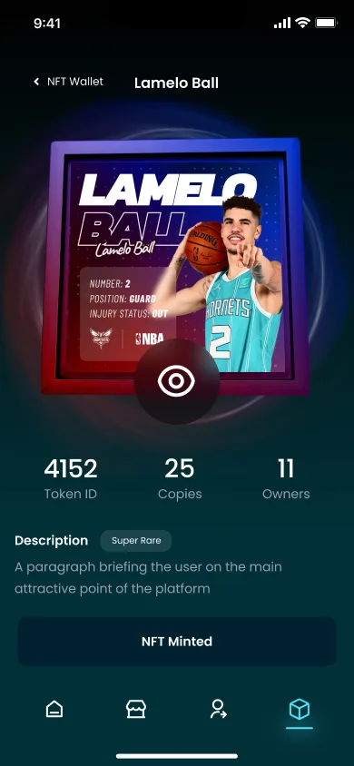
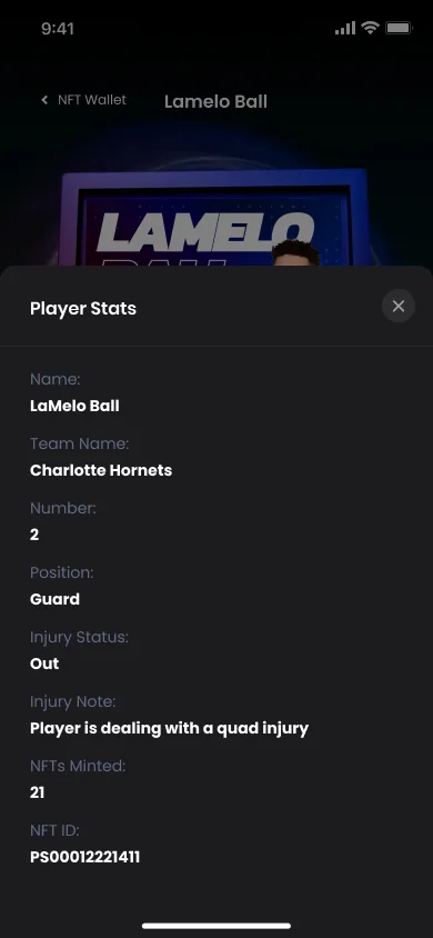
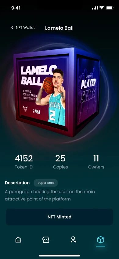
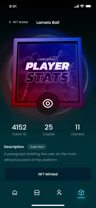
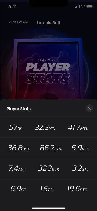
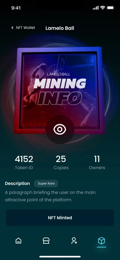
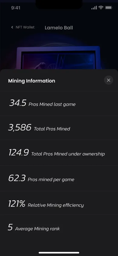
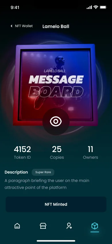
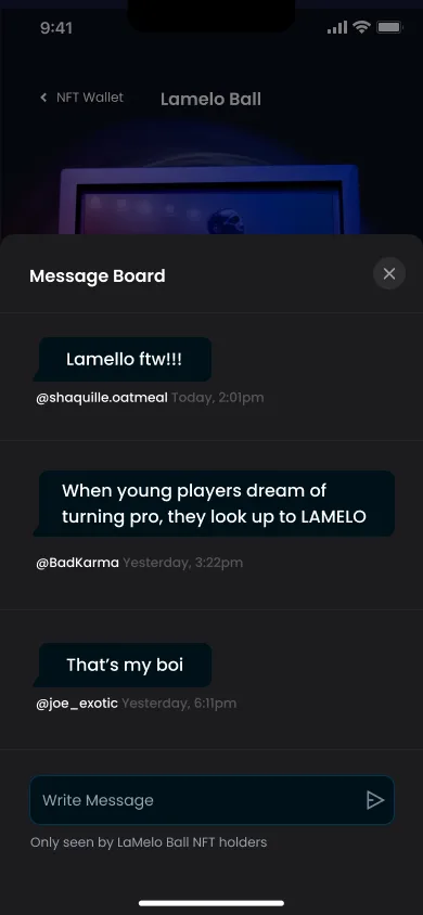
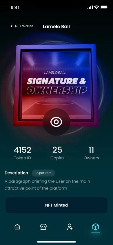
One of the biggest goals for the app was a dynamic, fluid feel that steered clear of the spreadsheet or notes-app layout so many fantasy sports apps fall into. The cube became the core of that idea. Everyone on the team responded to it, since it let us put different fields of information on each face and rotate between them.
I built out dozens of mockups to explore how that could actually work, going through round after round of revisions on how each display element looked, what information it showed, and how it was organized. Sports come with an overwhelming amount of stats, so making all of it feel engaging and easy to read mattered as much as the mechanic itself. Combining 3D design with iOS and Android's native info card components got us there.
I also worked with a 3D artist friend to build a render for the website that carried the cube's look through to that side of the product.
Results.
The brand and pitch decks helped Prospect secure their first funding round, and the product that followed shipped as a complete, functional app on the App Store and Google Play. The clearest signal of the work, though, came from the people I worked with and the attention the launch drew.
Chris was a pleasure to work with. He not only delivered exactly what we were after, but designed it in a way that was easy to update on the back end and visually pleasing and responsive on the front end. I can't recommend him enough!

Co-FounderProspect Sports