Design system · Mobile app · Strategy · UX/UI design
United Airlines
Overview.
Leading design for 16 million travelers.
United Airlines just passed its 100th year in the air. Today it's the largest airline in the world, flying more than 175 million people to over 350 destinations across six continents every year. The United app is how a large share of those travelers navigate their trips, and in 2025 I joined United's CoreUX team to lead UX design and strategy across it.
When I joined, Product and Design hadn't shipped any core product advancements together in three years. Internally, teams worked in parallel without a shared process, and it showed. There were inconsistent patterns, decisions made in isolation, and no unified point of view on what the traveler experience should feel like. That was the problem I was brought in to solve.
I put a real process in place. Structured design reviews. Shared timelines. Clear release milestones. Joint accountability between design and product for what shipped and when. I stayed hands-on across the full lifecycle, from concept to release, while coordinating directly with directors and VPs to keep the work aligned with business priorities at every level. Most importantly, every decision was designed to improve and simplify the overall customer experience.
The United app shipped four features together for the first time in three years: Virtual Gate, real-time bag tracking, personalized travel updates, and a United Club recommendation tool, announced by United Airlines in December 2025. They were the first visible pieces of a much larger reimagining of the in-app journey, one that will eventually span the entire trip experience from door to door.
Update: July 2026. United added a first-of-its-kind TSA security wait time tracker to the app, piloting at the airline's seven U.S. hub airports, giving travelers real-time estimates for both standard security and TSA PreCheck lines.
The work.
Technology
Travel
Industry
Lead UX Design & Strategy
Role
2025
Timeline
Design system
Mobile app
Strategy
UX/UI design
Services
Tools
What we built.
Four features shipped together this cycle. Virtual Gate, real-time bag tracking, personalized travel updates, and a United Club recommendation tool all faced the same underlying challenge. Information that changed constantly had to land clearly on a small screen, often in a noisy environment, often under time pressure.
Virtual Gate consolidated the fragmented experience of tracking your gate. Gate changes are among the highest-anxiety moments in air travel, and the prior experience scattered that information across notification formats and screen states that didn't connect with each other with meaningful consistency. The design work was about creating a single, confident source of truth travelers could trust. That trust had to be earned through clarity, not decoration.
Bag tracking addressed one of the most emotionally charged pain points in a travel experience. Once you've checked a bag, you want real-time confirmation it's actually moving with you, loaded onto the plane, unloaded, and waiting at baggage claim, not just reassurance after you've already landed and started to worry. The feature needed to give travelers a real sense of progress and capability, not just a status label. Designing the progression states required close collaboration with development teams to understand what information could be surfaced at each stage, validated for accuracy, and verified that the design didn't promise more certainty than it could deliver. Paired with United's earlier integration of Apple's Share Item Location for AirTag, bag tracking marked a real step forward in giving travelers peace of mind about their luggage.
Personalized travel updates was the most contextually complex of the four and will continue to evolve over time as the technology expands and develops. The goal was to surface the right information at the precise moment that you need it, and be specifically individualized to your itinerary. Not a firehose of alerts, and not silence when silence was wrong. The design challenge was defining the logic for when to surface what, and building notification patterns that felt like a helpful co-pilot rather than an interruption or causing notification-fatigue.
The United Club recommendation tool was a different kind of problem entirely. Rather than tracking a status, it had to make a judgment call about which nearby club was actually worth walking to. The feature weighs proximity to your gate against real-time capacity, so travelers aren't routed to a packed club a short walk away when a quieter one is a few more gates down. It launched first at Chicago O'Hare, with more airports rolling out through 2026.
Extending the system for Starlink.
Starlink is SpaceX's satellite internet network, and for airlines it means WiFi that's fast and reliable enough to actually replace what you'd use at home, not the throttled, buffering version air travelers had learned to tolerate. United is racing to outfit its fleet with it. More than 400 planes have it today, with close to 1,000 expected by the end of 2026 and the full fleet by 2027. CEO Scott Kirby has called it the biggest differentiator United has over every other airline.
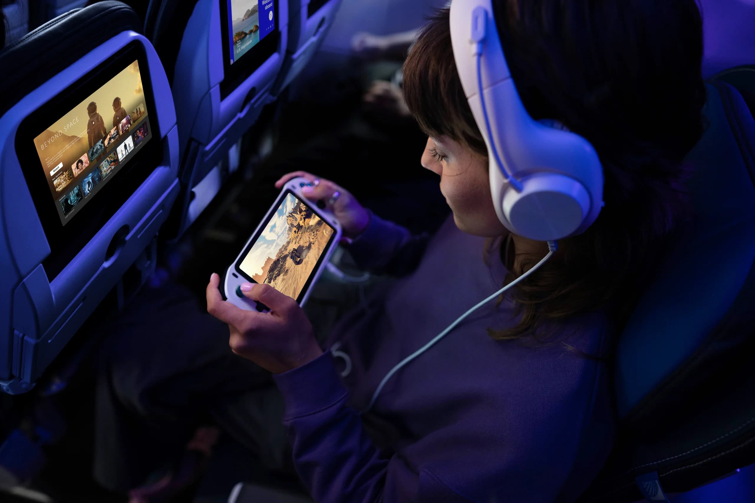
This engagement also included design work adapting ATMOS, United's design system, for the airline's Starlink rollout. As Starlink brought faster WiFi to the fleet, United paired that connectivity with a new cloud-based entertainment platform, including a 2025 partnership with Spotify for seatback screens, work that's since been shortlisted for a 2026 Crystal Cabin Award in IFEC and Digital Services. My role was to strategically advise how to extend ATMOS to support that experience across seatback screens and personal devices, working with the Starlink team to keep the visual language and interaction patterns consistent with the rest of the app. This included interface updates and iterations that are live today, as well as forthcoming updates to unify the overall design language between platforms with even stronger uniformity and cohesion.
Though I can't take credit for creating ATMOS, I built on it, and where its existing patterns didn't hold up under this new use case, I pushed for changes that benefited every team building on the system, not just the screens in front of me.
Leading the team.
I led a team of designers comprised of in-house and external contractors, though the role reached far beyond that team. Day to day, I partnered with the product team and its leadership to keep both disciplines moving together, while working closely with the accessibility, ATMOS, Starlink, and development teams to make sure the work held up technically and fit cleanly into the system. Above that, I worked directly with design leadership, directors, and VPs, translating between all of those groups to keep decisions moving, not stuck in revision hell.
That coordination wasn't only remote. I traveled between the Chicago and Houston offices to work directly with developer resources and strategic planning in person.
Translating between that many teams meant operating at multiple altitudes at once. Business constraints became design decisions. Design decisions became language that leadership could act on. Switching between them without losing quality at either level is one of the aspects I'm most deliberate about.
TSA wait time tracker.
The TSA wait time tracker is designed to solve a different kind of uncertainty than anything in the previous release. Security wait times vary constantly, by lane, by time of day, by airport, and travelers have requested for years to have an accurate estimate of wait times that they could actually trust, not a guesstimate dressed up as data. The design challenge was estimating as accurately as possible without overpromising. Separate figures for standard security and TSA PreCheck lines, sourced from data United already had, gave travelers something specific enough to actually plan around, letting them choose the lane that fit their schedule instead of guessing.
We have been testing this internally and as a closed beta first at Chicago O'Hare, and now we're excited to roll this out as an open pilot project across the rest of United's seven U.S. hub airports, a first-of-its-kind offering from a major U.S. airline.
Results.
Since beta-testing began, United found that customers appreciated the transparent communication, the time saved, and the real-time updates, exactly the outcomes the redesign was aiming for. The features rolled out ahead of the 2025 winter holiday travel season, when United expected more than 10 million travelers, the busiest stretch in the airline's history at that time.